
GAINSystems
Redesign

Overview
The Client needed me to update their current design as well as their design systems for their supply chain software. The project took two weeks to complete and was completed in four phases. The phases of the project were as follows Discovery, Define, Develop, and Deliver.
The first thing I did was interview stakeholders to get to the root of the problem and hear of any constraints GAINS may of had. I found out that GAINS wanted to use as much of its old functionality as possible but wanted a fresher look while making any necessary changes to the UI that would make it more intuitive.
Discovery and Define
GAINS had many different screens so I only focused on the most used screens and functions for now. I started to conduct user interviews. GAINS wouldn't let me interview actual customers because of privacy issues so I picked super users of the software who were current employees of GAINS. I conducted six interviews and gathered many different insights.
After I did my user interviews and user tests, I noticed a lot of similarities within the data.
-
GAINS showed a lot of data and it needed to be easier to read.
-
They needed a style guide and design system to be more organized and help with consistency.
-
The UI needed an update and a newer look.
Before we started making these changes to designs we wanted to narrow in on a style for the UI and then apply that to the current functionality of GAINS. This would organize me and also give me a design system to work with.
Style Guide
I started with a color palette. I used a lot of the current colors but changed their hue. Next to the color hierarchy was also how the color should be used. Now we needed to think about an typography that is readable. we chose Open Sans. This style guide was a much need upgrade from the current one. This was also implemented across the brand.


Design System
Once the style guide was completed I needed to apply that to a lot of the current CTA and elements. The navigation is one of the most important elements of GAINS so I started there. I also designed their tool tips and right click options window.


Other key elements were buttons and tables. These components were designed in figma. The tables were made to be easily put together as as big of a table as you needed.


A significant part of this redesign was spent on the design of the graphs. the graphs needed to look like they belonged as well as convey the necessary to data to the user.

I wanted to represent a lot of the actions you could take through icons. This would help with the amount of information you felt like you had to digest on a certain screen.
The cards for the portal needed to be rethought. Users found them confusing. The users needed context to where they were traveling next.

Also something else I needed to include in the design system was elevations to the UI. This would give the new UI a pop and it would add the hierarchy of the UI.

Wireframes
Once I had a direction I started to wireframe. This would give a general idea of how we wanted some of the screens to look. These wireframes needed to be approved by the president of product. He and I looked over the designs and made revisions which turned into the final product.


Designing the GAINS Portal
The Gains portal was the opening page of the software. A lot of users were confused by the fuel gauges and the graphs were hard to read. there was also a lot of functionality that no was using anymore so I advised it being removed.

GAINS Portal Reimagined
I changed the gauges to have more information on the tiles so the user had context of the next screen they were traveling to. I also changed the graphic of the gauge to be a percent which made more sense with the data it was representing.
The graphs needed to be updated so I changed the color scheme and made them more intuitive. this was done by using familiar icons and actions for the user.
A lot of the current functions were kept but were redesigned. Like the nav bar. That was kept the same in function but it now looks different.

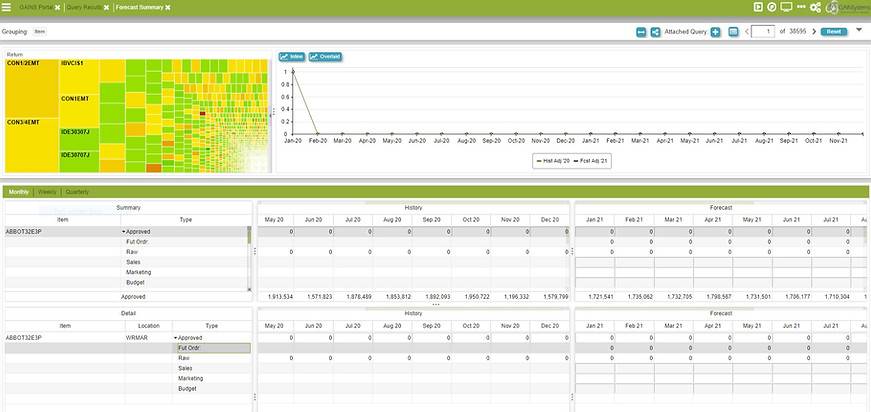
Forecast Summary Before
"Forecast Summary" is the name of a screen within GAINS software. What I learned I needed to change from the research is below.
-
The grid needed to be made more legible. Also the functions for the grind were confusing and hidden.
-
The graphs needed to be updated to the new design. Also the actions you could take on the graph needed to be more obvious.
-
How the screen was navigated was confusing and needed to redesigned.
Forecast Summary After
Below is what was changed to the forecast summary screen.
-
We changed the grids to be more legible and the actions for sorting were made obvious. Our users used excel so we added a function in GAINS that would notify the user by a triangle in the upper left corner of a cell within the grid. This triangle would indicate something to user by its color.
-
The Graphs were updated with a design system that made them more consistent and legible. the actions were also listed out for the user so they were easy to find.
-
The navigation was consolidated into a main navigation and a secondary nav that had most of the same features but could also have screen specific actions.

3.
1.
GAINS Calendar Before
The GAINS Calendar was a screen that was used to control how many other screens worked. You could use this screen to set paramaters around certain skuls or locations. You would know that know. Here is a list of changes that need to be made to the current screen.
-
The layout was confusing. People wanted to see a traditional calendar.
-
I needed to add the current design system to the product.
-
The Calls to Action were hidden and hard to find.

Some call to actions were hidden inside the grid!
GAINS Calendar Redesigned
Here you can see all the changes I made to the current screen.
-
I changed the calendar to a traditional looking calendar interface. This gave the user a sense of understanding once they opened this screen.
-
I needed to add the current design system to the product. The new navigation and logos were added the design. Also the new color schemes.
-
I brought out all the CTA in the interface. I added a override section where you could make overrides to a certain skul. This made it more visible and made it easier to use.

3.
1.
3.
2.
1.
2.
2.
Deliver
I kept implementing the new design system and style across the platform. This meant meeting with the development team twice a week. I would prepare tasks for the development team and let them set their own time table for these tasks. If more time was needed for a task, this was allowed as long as it was a logical reason. The tasks I would prepare were wireframed/prototyped screens that were annotated with explanations and or answers to their questions. As they finished tasks I kept preparing them till every screen was how we wanted it.
Here is a video of a prototype. This was part of a user flow that would have been handed off to the development team.
In the end this project was so fulfilling and I am so grateful to GAINS for letting me participate in their redesign and really make a change at the company.